Yoga fashion has gone through a remarkable transformation over the past decade. What started as purely functional activewear has evolved into a dynamic expression of identity, confidence, and lifestyle. The colors we choose to wear during yoga practice or as part of athleisure outfits reflect feelings, aesthetics, and even personal values. Today’s yoga fashion no longer revolves around neutrals alone; instead, it spans from calming earth tones to bold electric hues that make powerful visual statements. Understanding how these color aesthetics have evolved provides insight into both cultural shifts and consumer preferences shaping the yoga fashion market.
Why Color Has Become a Defining Element in Yoga Wear
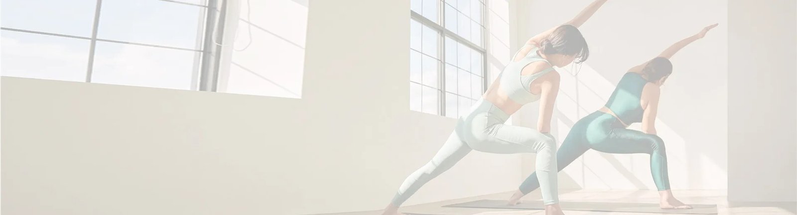
Color influences how we feel, behave, and connect with ourselves. For yoga practitioners, color plays an even deeper role because yoga is not only a physical activity but also an emotional and spiritual practice. The shade of leggings, sports bra, or matching set worn during yoga can encourage calmness, confidence, empowerment, or creativity.
As yoga expanded from private studios into mainstream culture and everyday fashion, clothing brands began paying more attention to the emotional resonance of color. Social media platforms also contributed to this shift. When yoga influencers share outfit-of-the-day posts, color becomes central to the visual story. Clothing is no longer just about movement—it is also about expression, identity, and belonging. This is why the color palettes in yoga wear today are more varied, intentional, and trend-driven.
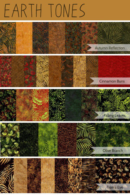
The Lasting Attraction of Earth Tones
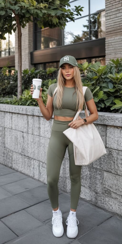
Earth tones have maintained popularity because they convey groundedness and calm—qualities aligned with yoga philosophy. Colors such as moss green, clay brown, muted olive, sandstone, and warm taupe resemble natural landscapes. When someone wears an earth tone yoga set, it creates a soothing visual experience and feels effortless to style. These colors pair well across seasons and work harmoniously with minimalist lifestyle wardrobes.
Earth tones are closely associated with sustainability. Many eco-focused yoga wear brands use natural dyes, organic materials, and recycled fabrics, and their visuals lean toward warm, nature-inspired palettes. The simplicity of these colors reflects mindfulness and a slower approach to consumption. For many consumers, wearing earth tones is not just a fashion choice—it is a value statement that supports simplicity and connection with the environment.
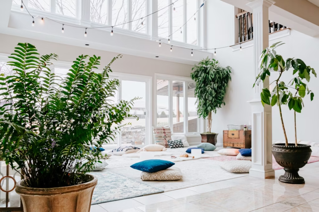
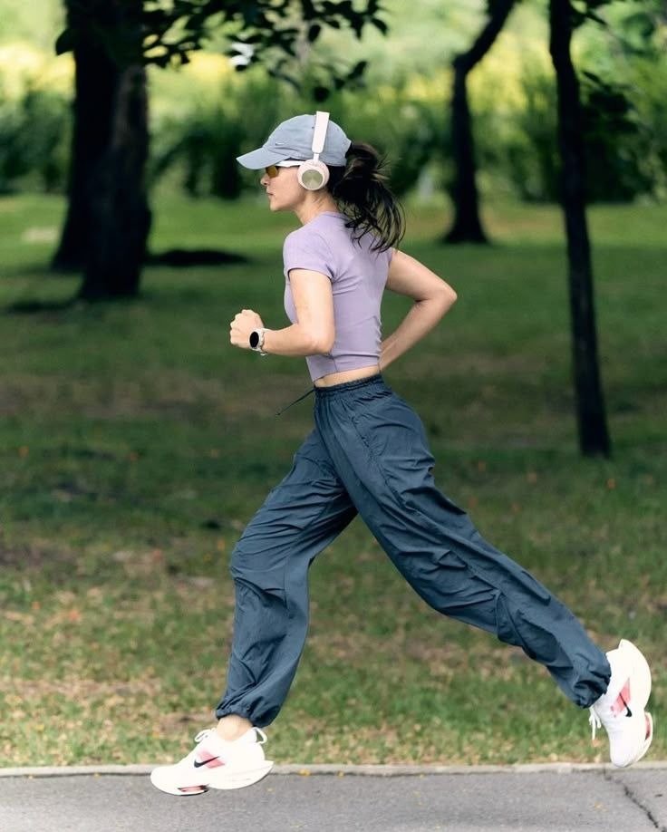
The Growth of Soft Pastels and Serene Color Palettes
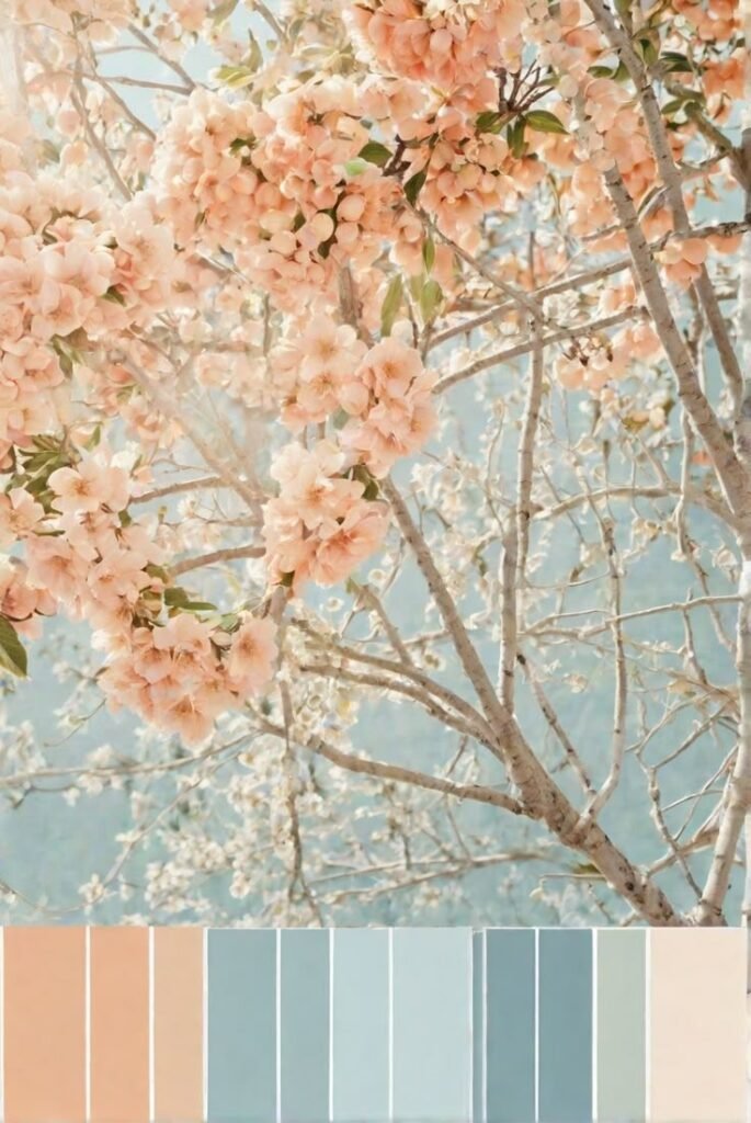
Pastel colors have become increasingly popular for yoga outfits that transition easily from practice to daily life. Shades such as dusty lavender, pale peach, powder blue, and rose blush evoke comfort and softness. They are emotional rather than loud—representing lightness and ease. Pastels are commonly used in seamless matching sets, rib-knit yoga bras, and sculpt leggings designed for casual, gentle movement.
These colors appeal especially to those who view yoga as restorative rather than intense. They remind people of slow mornings, calm breathing, and taking time for the self. This is why many wellness-based social media brands lean toward pastel aesthetics in photography, mood boards, and product line visuals.
The Rise of Electric and High-Energy Hues
On the opposite end of the color spectrum, bold and electric colors have gained popularity among consumers who want their outfits to express vibrancy and confidence. These colors are not subtle—they demand attention. Neon green, electric blue, fuchsia pink, and citrus orange highlight energy and movement.
Electric hues frequently show up in power yoga studios, dance-inspired fitness spaces, and social media workout content. They photograph vividly, which makes them appealing to influencers and activewear brands that prioritize visually impactful marketing. While earth tones communicate serenity, electric tones communicate empowerment—both meaningful in different forms of modern yoga expression.

Comparing the Emotional Tone of Yoga Color Palettes
The wide range of available color aesthetics can be divided into recognizable categories. These categories help brands and consumers understand how color choices relate to mood, styling, and lifestyle expression.
| Color Direction | Examples | Emotional Tone | Best Fit For |
|---|---|---|---|
| Earth Tones | Sage, Clay, Sandstone | Grounded, calm, balanced | Minimalist and eco-focused wardrobes |
| Pastel Shades | Lilac, Blush, Cream Blue | Soft, gentle, approachable | Everyday yoga and lifestyle wear |
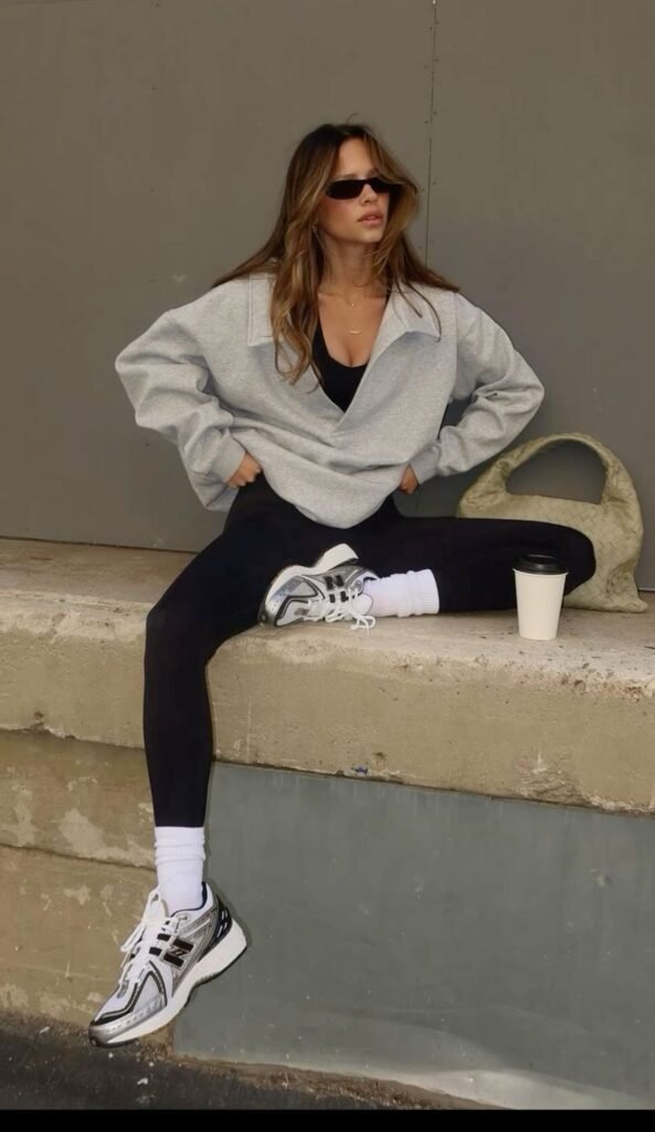
| Deep Neutrals | Black, Espresso, Charcoal | Clean, strong, steady | Studio practice and long-wear essentials |
| Electric Hues | Neon Pink, Lime, Electric Blue | Confident, bold, expressive | Trend-forward activewear and street-inspired looks |
This table demonstrates how color is more than decorative—it shapes the emotional experience of wearing yoga clothing.
Matching Sets and the Role of Color Harmony
Matching sets have become one of the most influential trends in yoga fashion because they create a polished appearance effortlessly. A coordinated sports bra and leggings set forms a clean silhouette that visually elongates the body. Color harmony plays a significant role here; whether someone prefers earth tones or electrified shades, matching sets simplify decision-making and enhance style consistency.
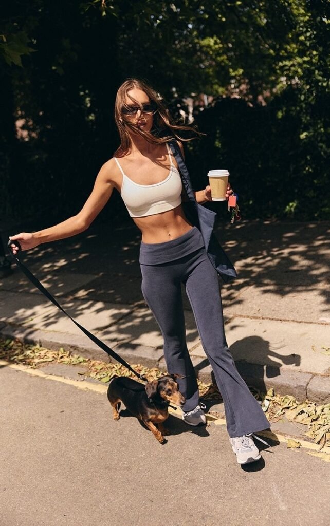
These outfits are particularly popular in athleisure styling where yoga clothing is worn beyond the practice room. A matching set paired with a soft cardigan, denim jacket, or oversized hoodie transitions seamlessly from studio to street. Because color unity helps create a cohesive look, brands now release matching sets in full seasonal palettes to reflect evolving fashion moods.
Streetwear Influence: Yoga Fashion Becomes Everyday Fashion
The merging of yoga wear and streetwear has influenced how colors are chosen for new releases. Instead of focusing exclusively on performance, brands now consider how yoga outfits look when styled with everyday pieces. This shift has led to a rise in versatile tones like stone gray, mauve brown, oxidized blue, and washed eucalyptus green.
These colors feel elevated enough for daily wear while still aligning with comfort-focused lifestyle wardrobes. The goal is to create yoga clothing that supports full-day functionality—morning practice, work-from-home hours, and evening social outings. Colors that blend naturally into streetwear wardrobes are more likely to stay relevant beyond seasonal trends.
Sustainability and the Return to Natural Aesthetics
Sustainability movements continue to shape yoga fashion color trends. Consumers who prioritize eco-conscious lifestyles often prefer shades inspired by nature and botanical palettes. These tones subtly communicate authenticity and environmental awareness. When combined with recycled materials and ethical production stories, natural-inspired colors carry greater meaning.
This aligns yoga fashion with wellness values: balance, restoring harmony, and making conscious choices. As sustainability becomes increasingly mainstream, we can expect more brands to embrace nature-colored dye systems, organic fibers, and minimalistic color collections.
Conclusion: A Future of Balance Between Calm and Color
The evolution from earth tones to electric hues symbolizes a broader cultural shift. People are embracing both calmness and strength, softness and boldness, grounding and self-expression. The future of yoga fashion will not be defined by one palette alone. Instead, it will embrace range and fluidity.
Colors in yoga fashion are no longer about blending in—they are about feeling aligned. Whether someone chooses a soft beige set for morning meditation or a neon pink outfit for an energizing flow, the focus is the same: wearing what feels like an honest extension of the self.

![[JuncoSports]The Insider's Guide to Sourcing High-Quality Wholesale Yoga Apparel](https://www.juncosports.com/wp-content/uploads/2025/07/image-15.jpg)
![[JuncoSports]From Studio to Street: Top 5 Wholesale Yoga Apparel Trends for Maximum Profit](https://www.juncosports.com/wp-content/uploads/2025/07/image-16.jpg)
![[JuncoSports]7 Red Flags to Watch for When Choosing Yoga Clothing Suppliers](https://www.juncosports.com/wp-content/uploads/2025/07/image-17.jpg)